Contact Us Customization
Customization pattern creation for NCR banking products
NCR offers banking solutions to their customers, including a website and mobile app that their end users can utilize to look at their bank account information, make payments, move money, and more features that you would typically see in a modern banking application. Different clients have different needs, which is why we also provide a software tool that allows these banks to customize the features of the products for their end users. Before this project, there was no way to customize certain pages without contacting NCR directly and working with them to make the change. We wanted to provide a way for banks to easily build certain pages to fit their needs without the friction of manually reaching out for changes.
I led this design process, introducing a new pattern that would allow our customers to see previews of their pages in real time as they made updates. This pattern was originally designed for the Contact Us page, but was created to be scalable for other implementations of the pattern in the future, such as Login pages and Payment pages. This solution also had to incorporate previews for all device types, such as web and native mobile, which share the same data but have different UIs.
• UX Designer
• Me
• 1 Product Manager
• 2 Software Engineers
• 1 UX Researcher
• Brainstorming
• Iterative Design
• User Testing
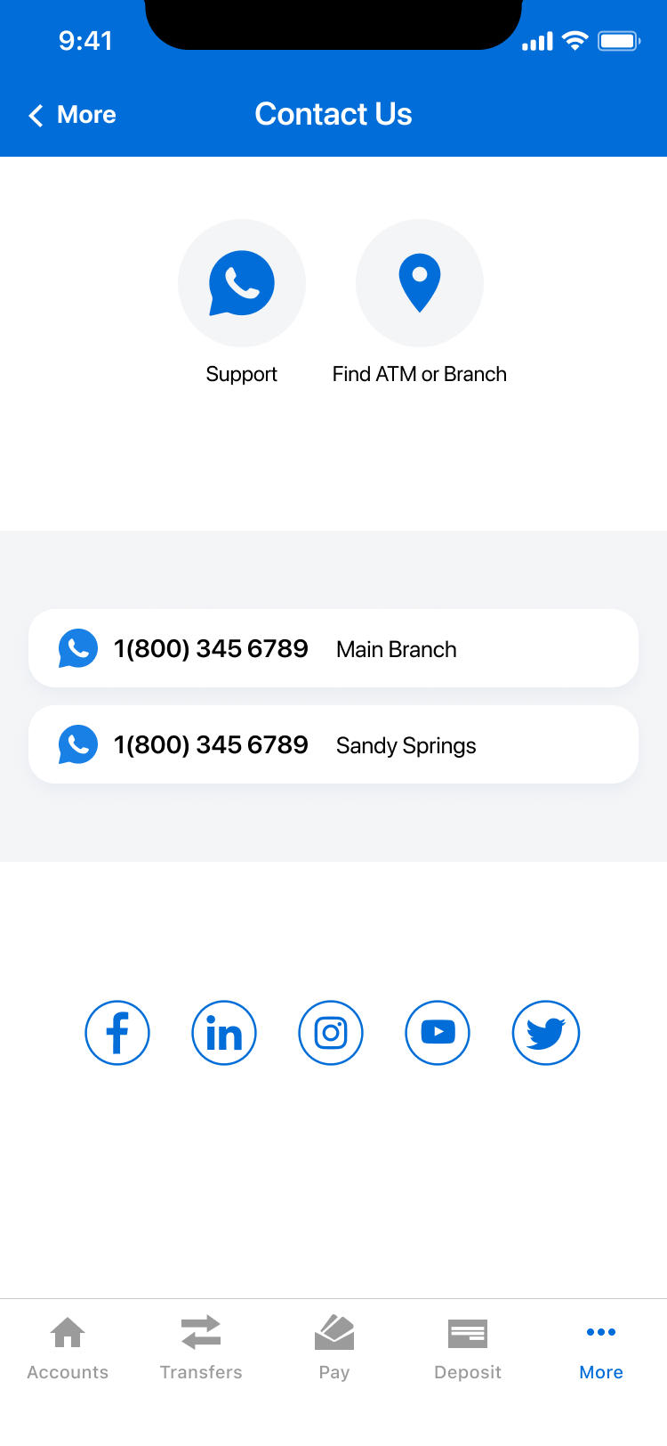
Before this effort, there was no Contact Us page in our product. As a workaround, banks would customize their app's navigation to hardcode their contact information as plain text. When UX began designing the Contact Us page, I worked in tandem with them to align on what users would want to see from the Contact Us page, and what banks would like their users to see.
Contact Us was a strong use case to begin with because of the simplicity of its parts along with the fact that it was being developed for the first time. Because of this, we could work with engineering to ensure that we align on which parts can be customizable by the banks.
While this new feature has easy moving parts, there are still some complexities, such as differences between web and mobile, that it would allow us to consider different edge cases that will help the customization pattern scale to other areas of the product.
First, I considered the types of interaction that a page builder tool could use. I took inspiration from other customization softwares, and weighed the pros and cons according to the needs of our users and the limitations from the customization software and end user banking products. I met with stakeholders to introduce these concepts and iteratively design on them to reach a satisfactory design that met product requirements, engineering requirements, and informed design that would then be brought to end users for testing.
Pros: Great for tactile manuvering of items, easy to see in real time how changes are made.
Cons: Not all sections are the same across web and mobile, so it may be jarring to see some items move in web while none move in mobile, and vice versa. Also, moving items across sections could be difficult.
Pros: Easy to see all information at once, and move around information in between sections as needed.
Cons: Potential information overload. Lots of scrolling. Having one save button for all information may cause confusion if there are any errors.
Some information is mobile only or web only. How would a user identify available sections and where the information would be placed?
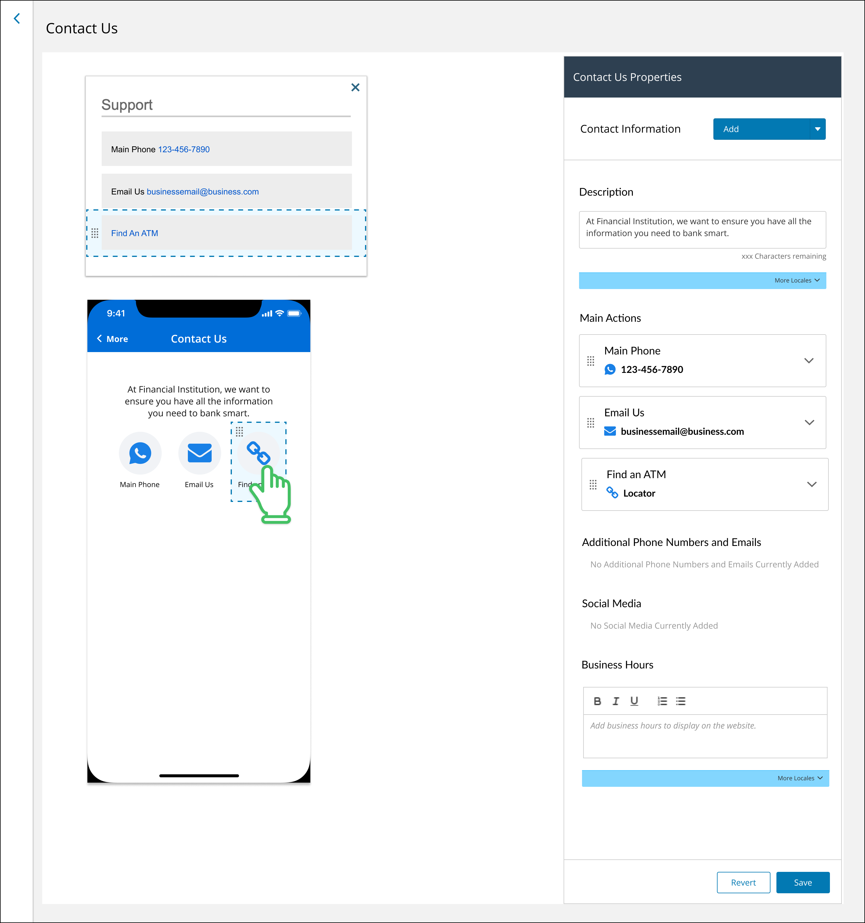
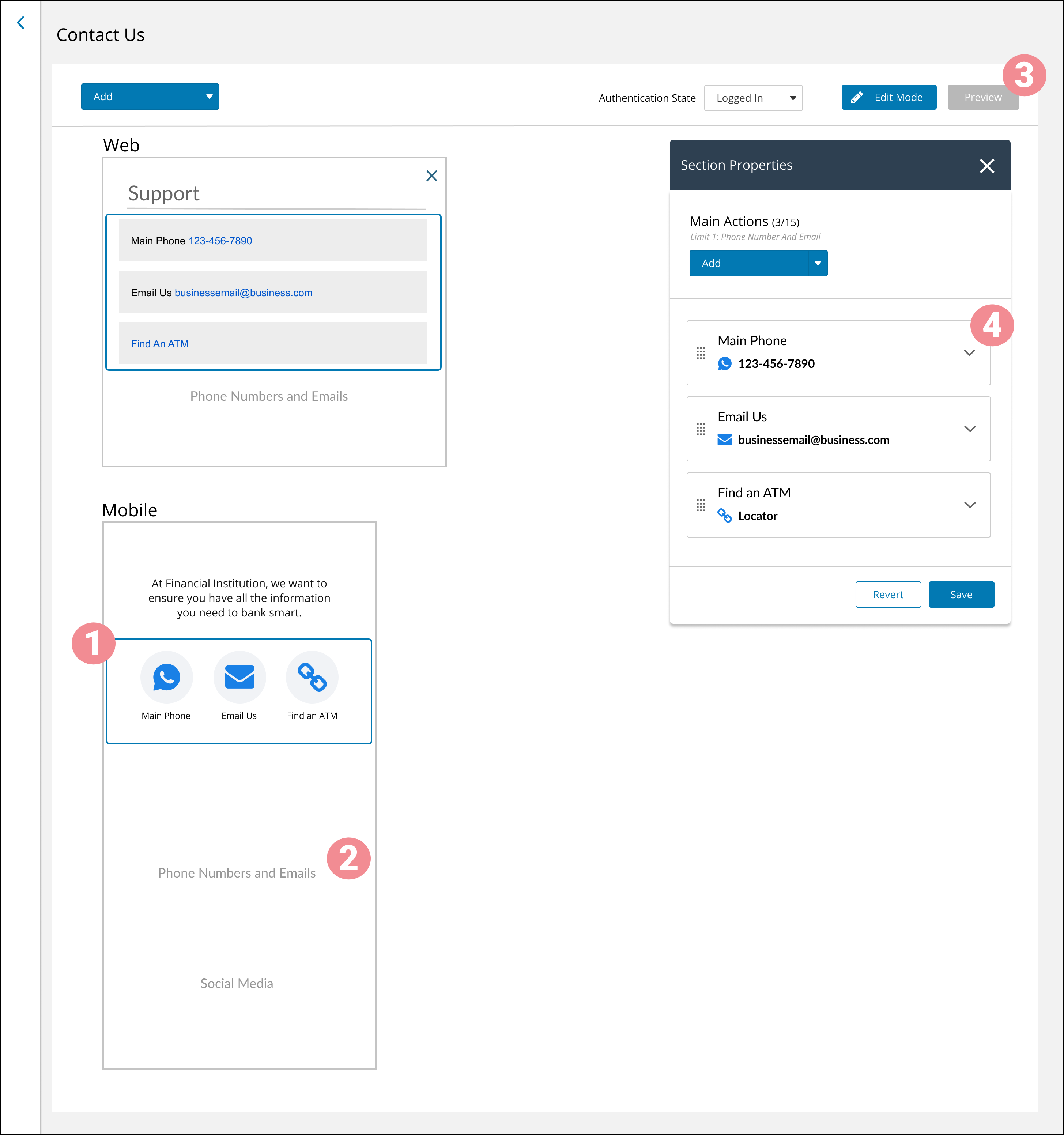
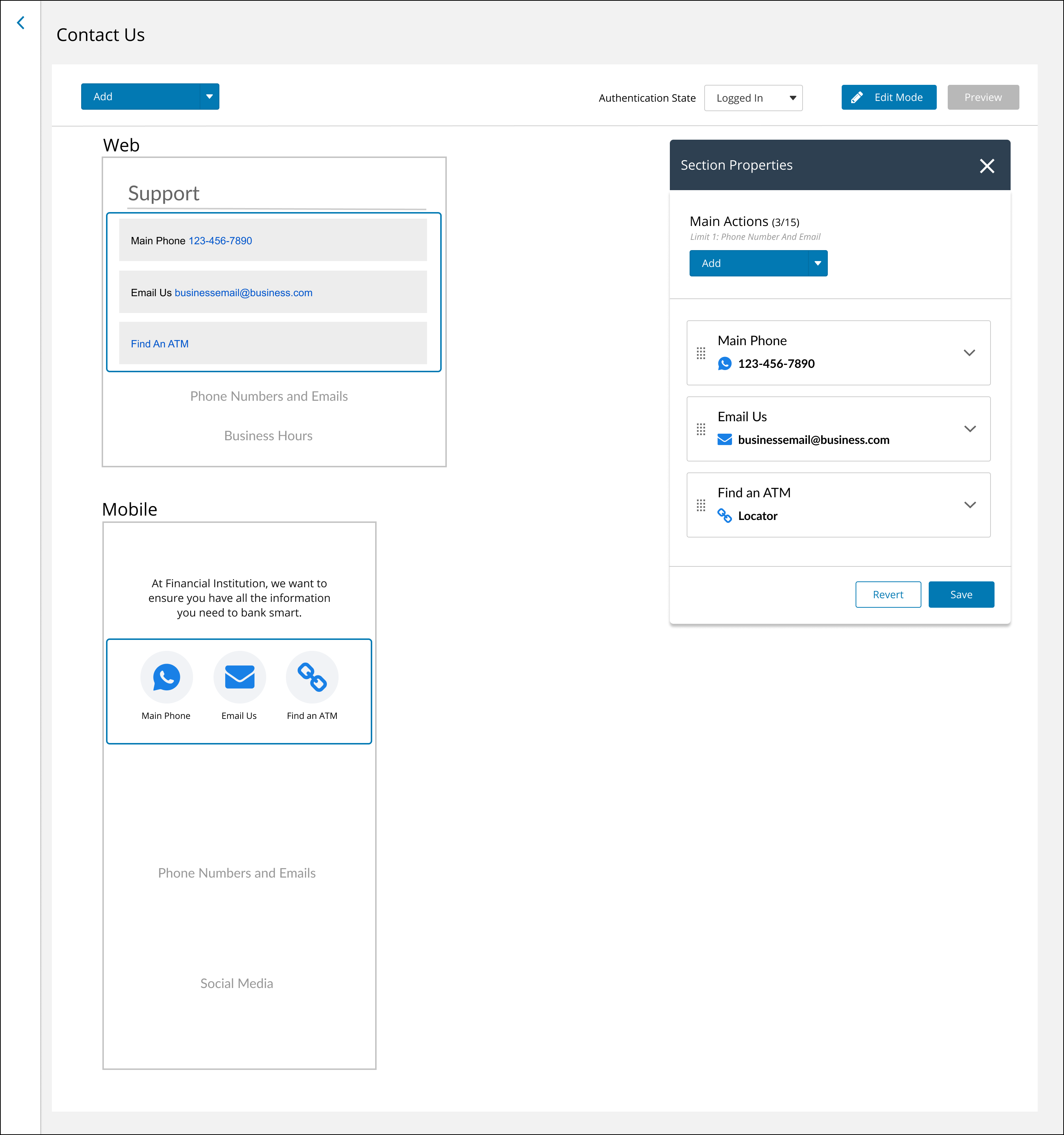
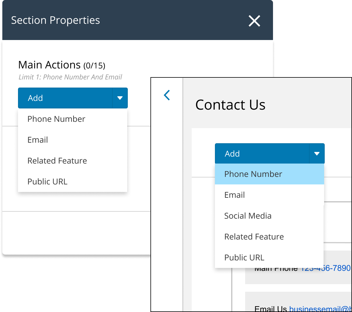
To open a panel, the FI clicks a section on the preview.
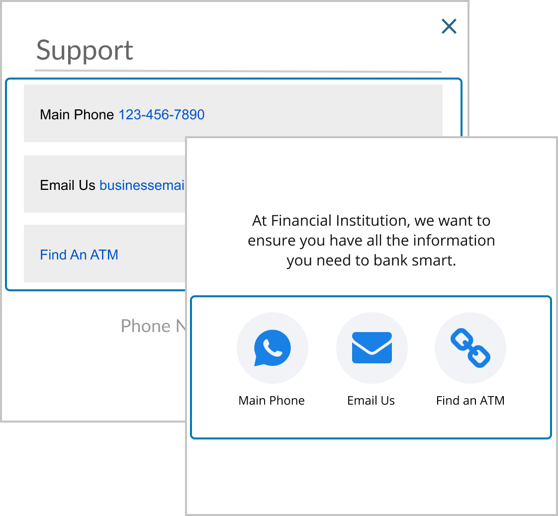
If a section is empty there will be a section guide in the preview screen with a gray title to indicate that the area exists. When items are added to a section in the panel, the preview will update accordingly.
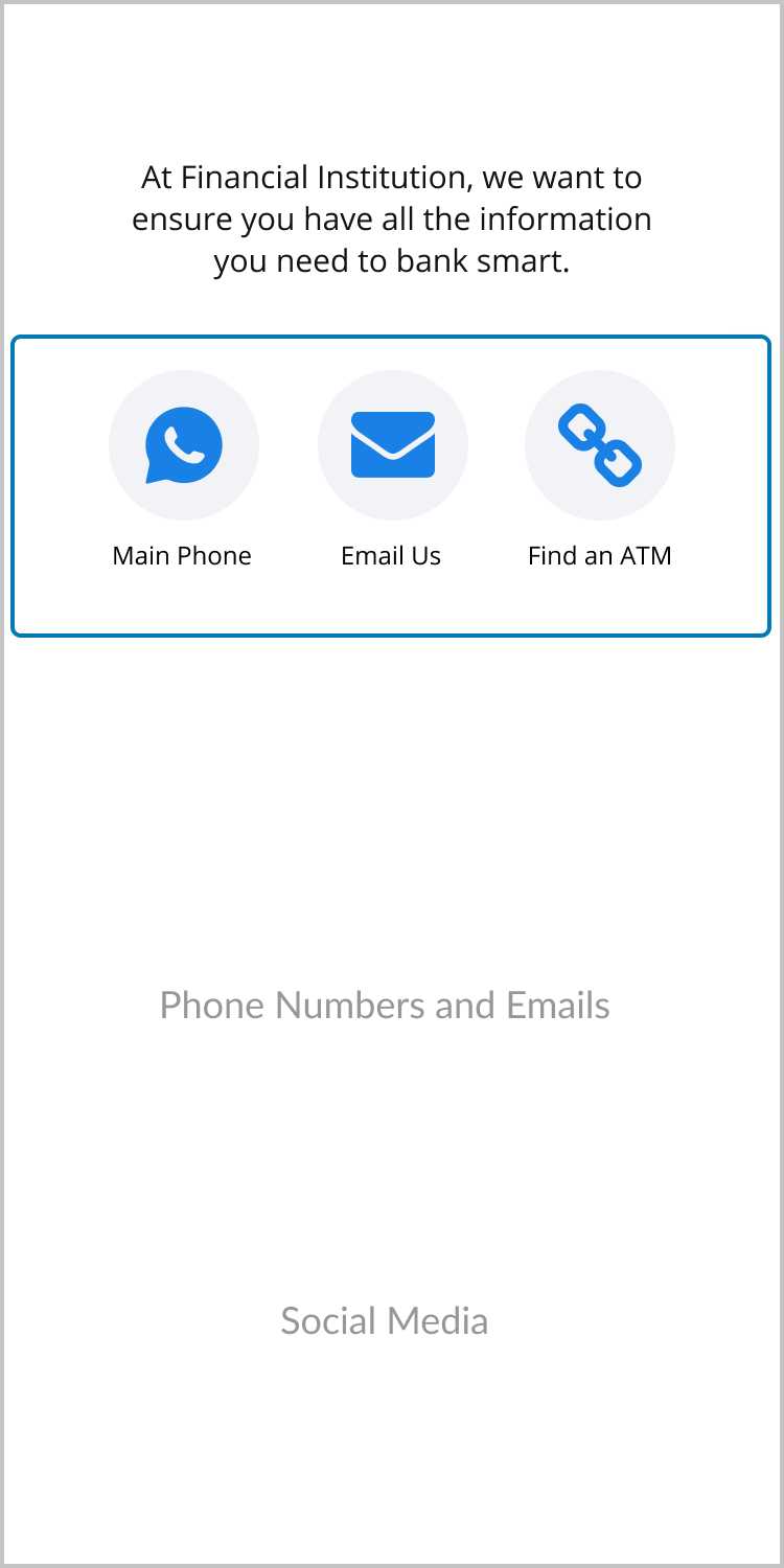
Preview mode will make the screens uninteractable and remove the gray section guide titles.
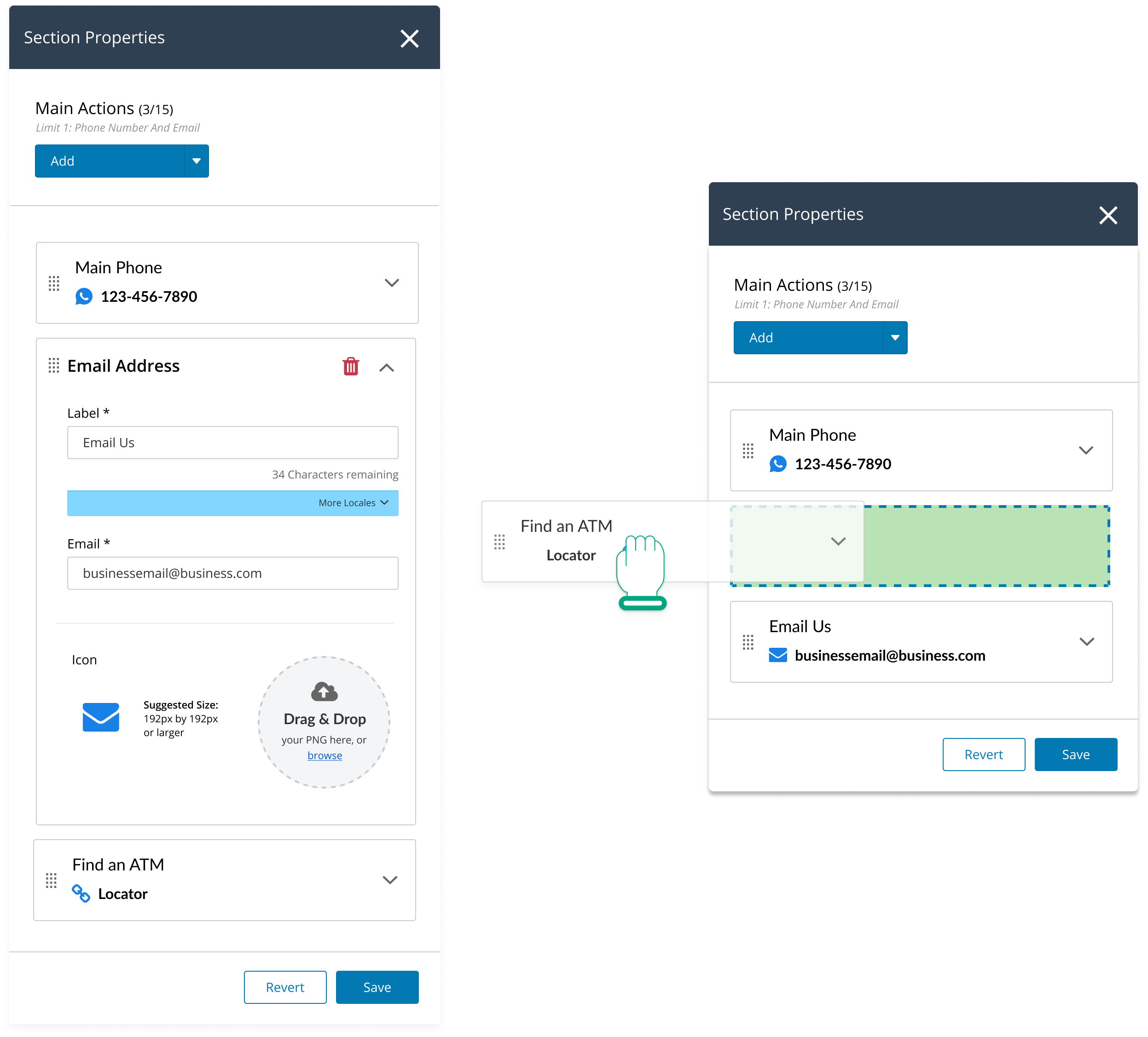
Cards in a section have drag and drop capabilities to change the order of the information. This satisfies changing the order across web and mobile consistently without jarring users through drag and drop on the previews.
• Most participants added items from the panel, not the top “Add” button
• Participants expected to only be able to make changes when in “Edit Mode”
• All participants able to edit item order in properties panel
• 2/5 participants expected to drag items on left frames
• Confusion on what main actions are
• ”Main actions is a bit ambiguous… could be whatever you want it to be”
• Participants understood what sections meant, and that they were interactable
• Participants noticed differences in web vs mobile but generally were not able to identify the reason for these differences
This feature has been implemented and is currently in production. This pattern has now been expanded to other capabilities, such as the login page and other internal features, however I cannot share these designs as they are not yet in production.
• Designing with multiple devices and products in mind, each with different requirements.
• Collaborating wtih engineering on a solution that is attainable within the software's architecture, while implementing the best user experience possible. This includes compromising and being adaptable to changes during the iterative design process.
• Scaling a solution that will work across different types of use cases with the same ease and consistency
• How might we create a more tactile, interactive page builder?
• How do we expand this capability into all areas of our products, giving the power to the customers to create great experiences for their users?