Overview
The Problem
For State Farm, tracking claims are integral to customer security and trust. Customers want to know when their claim has been processed, when it’s moving along, and when they have items in the claim that they need to address. However, for customers using the app, there were a lot of issues with the claim tracking process. Steps were not clear, and it was hard to see how much time a certain process would take. In addition, information about a claim was hard to find through the current organization of the page.
The Solution
During my internship, a UX designer, content strategist, and I were tasked with coming up with a redesign for this process that would align with brand standards and website standards, and would create a better user experience. We would collaborate with developers, technology analysts, and UX researchers to determine the best solution that would help customers better understand where they were in the claims process and help better find important information relating to their claim.
My Roles
• UX Designer
My Team
• Me
• 1 UX Designer
• 1 Content Strategist
• 2 Mobile Developers
• 2 UX Researchers
• 1 Technology Analyst
Methods Used
• Understanding the Claims Process
• Preliminary Research on Current State of Claims Process
• Exploratory Design
• Information Architecture
• Usability Testing
• Iteration on Design from Usability Testing
Research Process
Understanding the Claims Process
*
How do customers file a claim?
*
Once they file a claim, what steps do they take next?
*
What information do customers need to know about their claim?
Preliminary Research on Current State of Claims Process
I also needed to understand the current state of the process in the app, as well as what research and design had been done before I began my internship. I did a review of the current claims process in the app, and spoke with UX researchers about their criteria for a redesign.
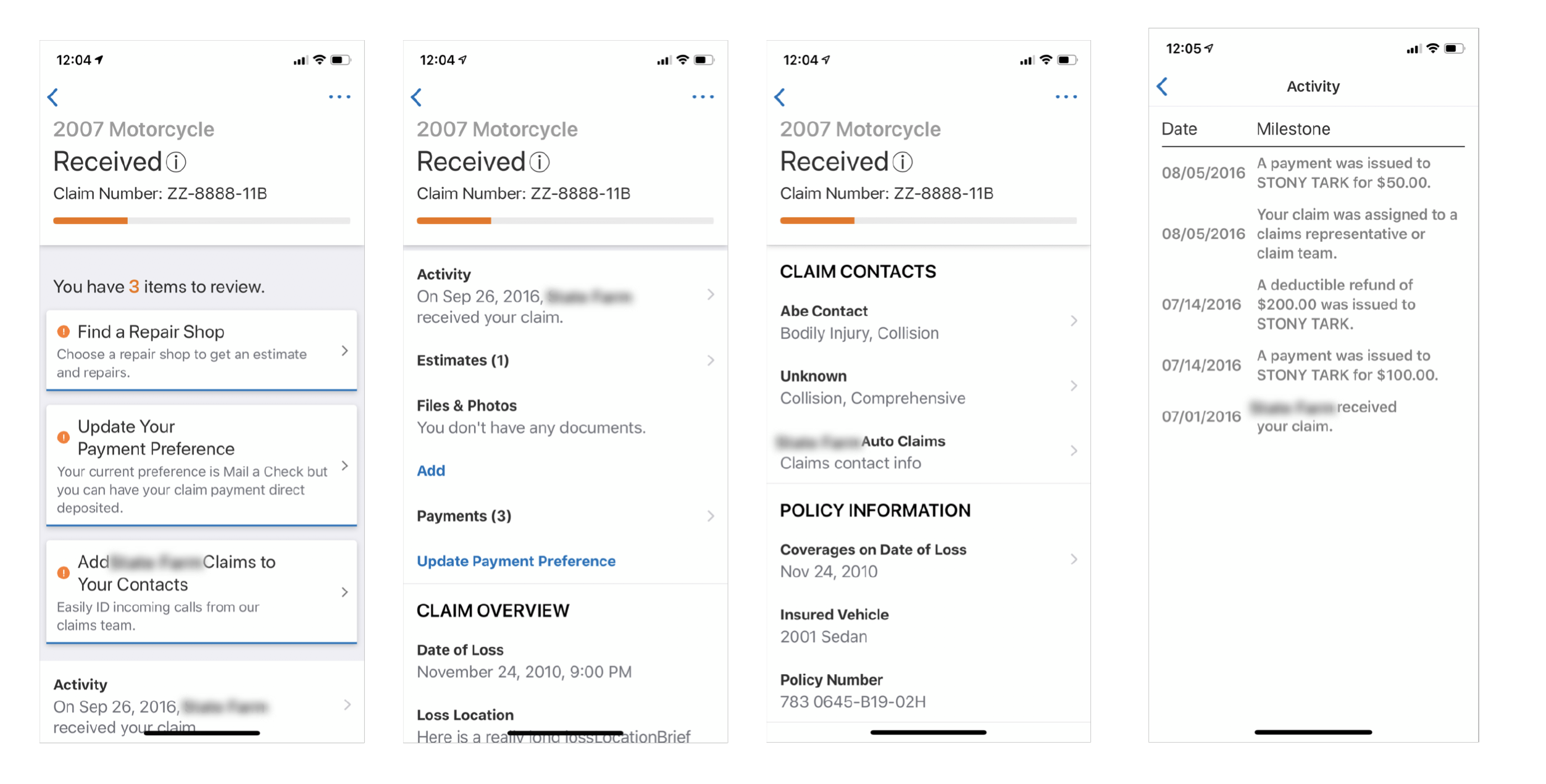
Screenshot of the current claims tracking screen in the app
UX Researchers were able to supply me with key criteria for the redesign. Based on previous iterations of the claim tracking for the web, we were able to gather these facts from past usability tests:
1.
Make sure the action items are visible on the screen
Most users were confused by red and gray bars only to indicate “Required” and “Recommended” tasks, so make sure the wording is present for each task.
2.
Make sure users know what tasks are “Required” and “Recommended”
Most users claimed they would click on ”Repair and Rental” in the timeline to request a rental, and some went to the action item for “Request a Rental”, so it was important to make the action items obvious.
3.
Make sure there is a visual status to show the user’s position in the claim process
Most users preferred the page to have a visual indicator for the status.
4.
Make sure all steps are shown on the screen with sufficient detail
Most users preferred seeing both completed and future steps in the claims process, and liked having lots of details about each step pertaining to their claim.
Design Process
Exploratory Design
Since this redesign was to take a new direction, I needed to understand how best to tackle the different sections of the process.
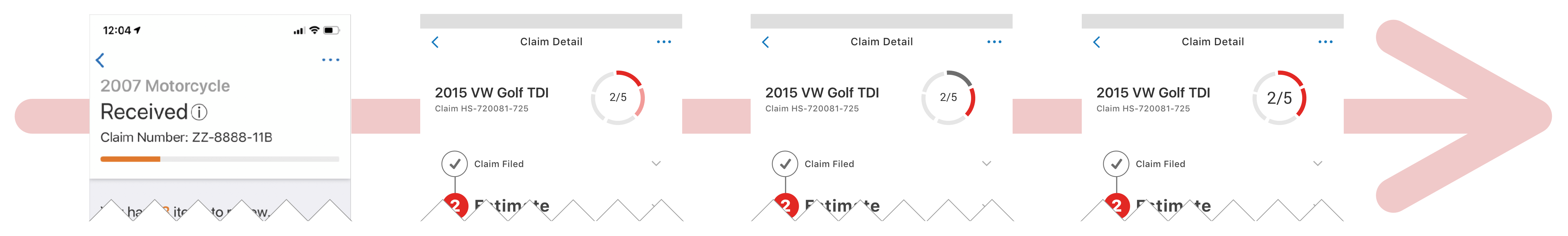
Visual Tracking
First, I explored the different ways I could design the visual tracking steps for the claims process. I researched competitors in order to understand how competitors were designing their tracking processes on mobile.
*
Shift from blue to red
Blue was the previous design standard for insurance-related screens. However, with the new design direction in motion, I opted to shift to red.
*
Numbered steps
The adoption of steps in the process was necessary for users to understand exactly where they are in their claim. I initially adopted icons to differentiate steps, but then moved to numbers as this makes the steps in the process clear.
Circular Progress Indicator
Next, I explored the different ways I could design a visual to quickly represent the step the user was currently on. Since the web team was exploring the same topic, I collaborated with them to come up with a solution.
*
Color treatments
Aligning the color treatments was important to maintain consistency across channels and allow users to quickly identify where they're at in a claim no matter what platform they use.
*
Accessibility
Determining accessible colors was important. Users need appropriate contrast to better see and quickly identify where they're at in their claim.
Action Items
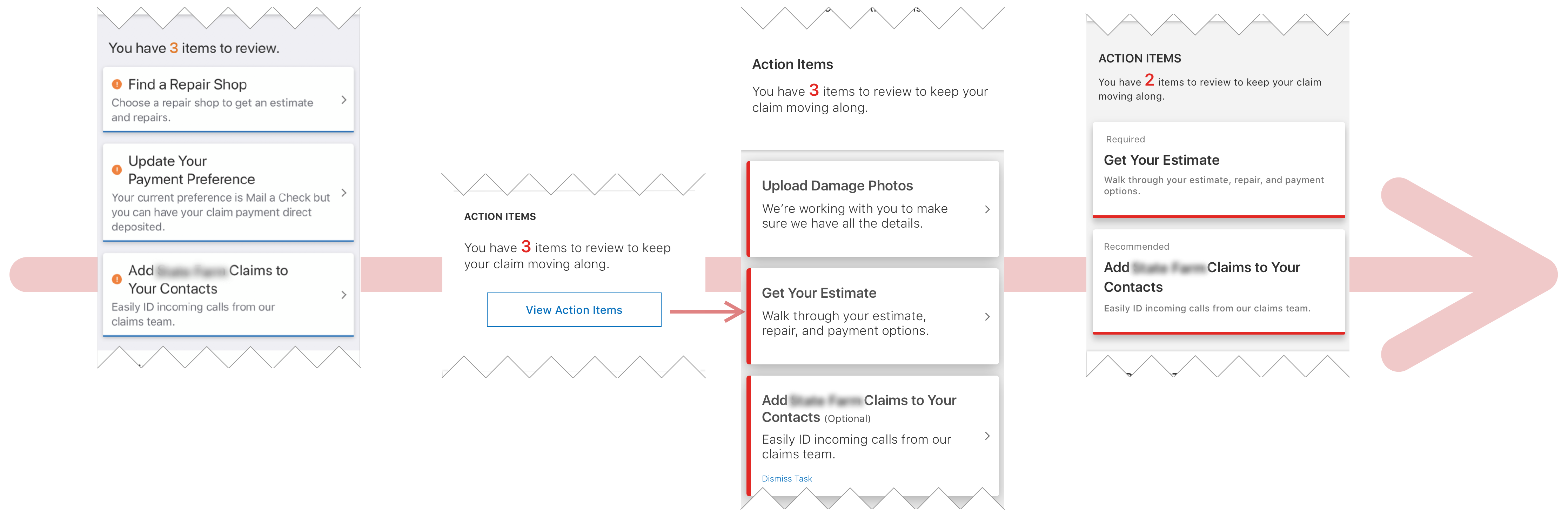
Next, I explored the different ways I could integrate the action items into the new design.
Since action items were deemed most important for our users, the visual tracking timeline was moved to a modal that could be accessed by pressing on the top level.
*
Required vs optional tasks
Previously, actions items had no indication whether or not the items were required or optional. This was important to distinguish these tasks as to not overwhelm and confuse the user.
*
Hierarchy
Since action items are important to the user when it comes to moving their claim along, we decided that the action items needed to be more front and center than other items on the screen.
“I would not have known there was something required that needs to get done.”
Information Structure
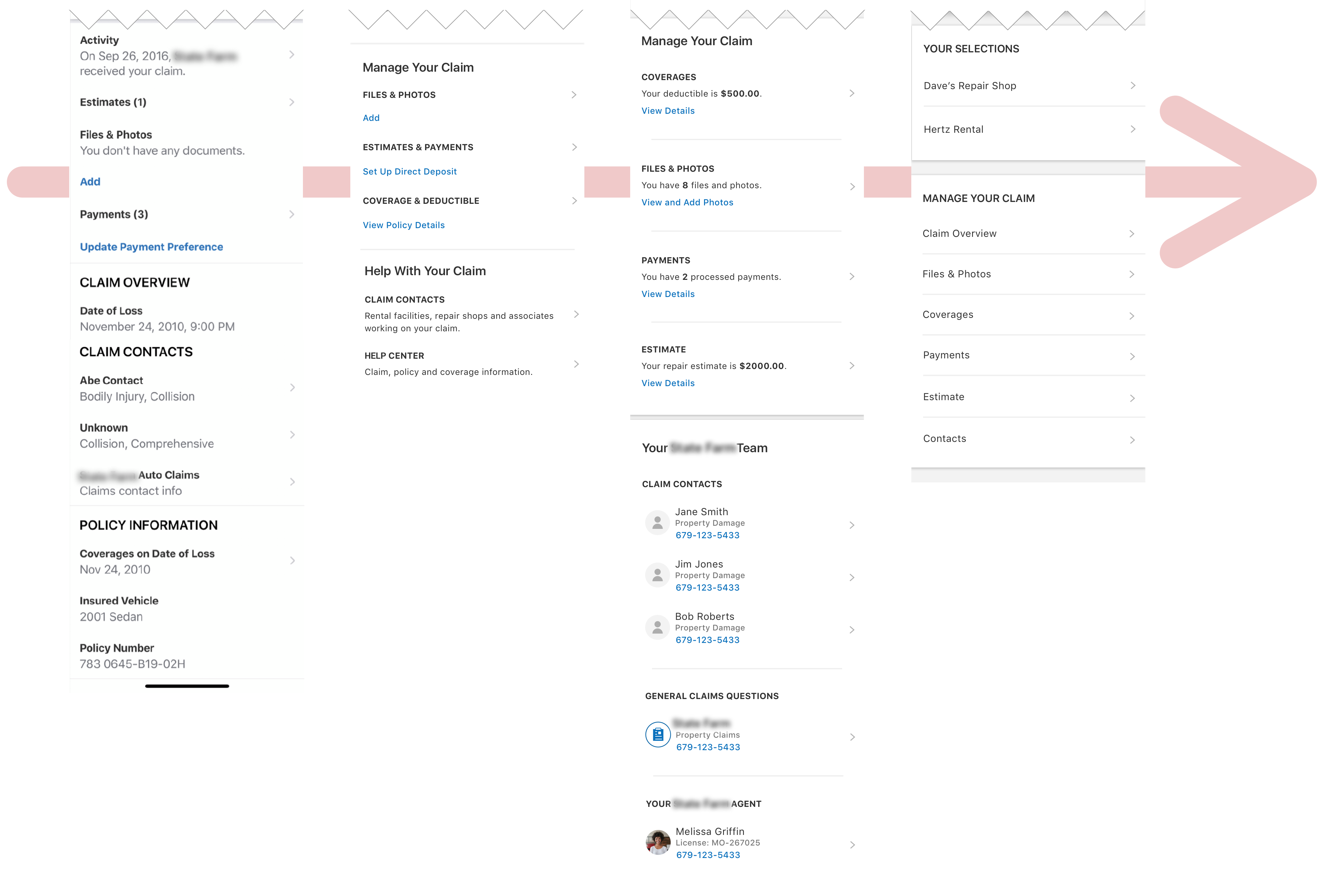
In addition to the items important for tracking, I also needed to provide quick access to information related to the claim, like coverages, photos, payments, and claim information.
*
Importance and hierarchy
Determining what should go on the screen, and in what logical order was important to ensure that users had quick access to the information that is most important to them.
*
Back-end efficiency
I had to consider software devlopment needs for this portion of the screen. Adding too much information on this screen would have increased the loadtime of the screen significantly, so I had to balance efficiency with sufficiency for the user.
Finalized Screen
1.
What is the most important information to the user?
This was deemed to be the current step the user was on in their claim, and what they needed to do next to keep their claim moving along. Because of this, we highlighted the current step and the action items all at the top.
2.
How were we going to label certain items on the page?
We had to ensure that the labeling was consistent in tone and voice, and was succinct enough for the user to accurately find information without overcrowding the screen.
3.
What else is important for a user’s claim?
Aside from tracking, we also had to consider the information contained within the claim, such as policy info, pictures, and payments, and how to properly convey where that information was stored. We created a hierarchy of information in order of most relevance for the user based on data gained from analysts.
Usability Testing
Usability Testing
7Participants
1Hour In-Person Sessions
For these usability tests, one UX researcher asked each participant to perform a series of tasks on the claim tracking screen, including tasks such as viewing their progress on their claim, or uploading a picture to their claim. The UX Research time compiled the results of the test, and shared it to the design team.
Updates were made to create the final version of the screen as seen at the top of the page.
Results
Insights
• All users understood they were on step 1 out of 5 in the claims process.
• Users understood that they had 1 required action item and 1 recommended to complete.
• All users noticed “View your Timeline” and said they would click on it to view the full claims process.
• Once viewing the timeline, a few users stated they would prefer to see the timeline before the claims details page.
• Users believed links in timeline were action items they needed to complete before moving on to the next step.
• Users assumed the action items were part of Step 1 until they saw the timeline.
“I would rather have it more clear what the next steps are in the process.”
Recommendations
*
Consider showing customers the timeline first and giving them the option to view all details, if needed.
*
Consider giving customers information about the next step on the claims details screen.
*
Align action items with timeline links whenever possible.
*
Allow users to see a visual representation of their in-progress step on the status icon (e.g., partially filled out line, dashes, etc.).
Final
What I Learned
• Collaboration across teams is essential to align with design goals and to make sure everyone is on the same page.
• Designing in industry is a lot different from designing in academia. A lot of shortcuts have to be made for the sake of time and resources. However, as designers, we have to be flexible and adapt to achieve great experiences for our users.
• For every questioned answered about the product space, there will be 10 more to take its place. Communication is key to understanding the problem space to address it properly and holistically.
• My Sketch and Invision skills improved as I learned more about symbols, libraries, and plugins to streamline the prototyping process.
Future Considerations
• Based on UX research, users liked seeing the timeline more than the overview. How might be design the timeline into the forefront of the experience?
• How might we integrate all aspects of the claim process (action items, uploads, steps, and timeline) into one seamless experience?
• How might we redesign the circular progress indicator to be more indicative of the user's steps in the process (if a visual indicator is needed at all)?