AutoMate
Brand design for a self-driving rideshare service
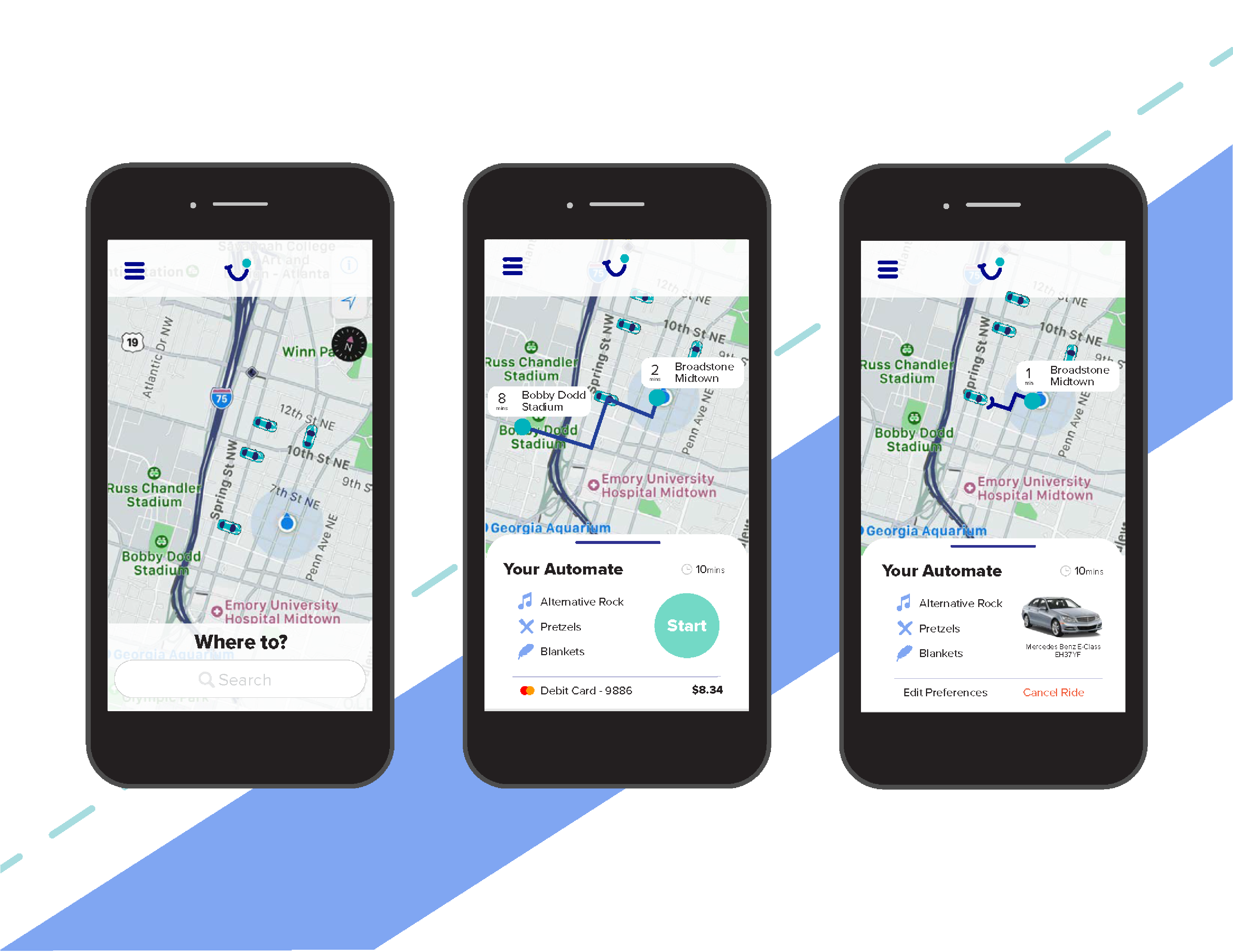
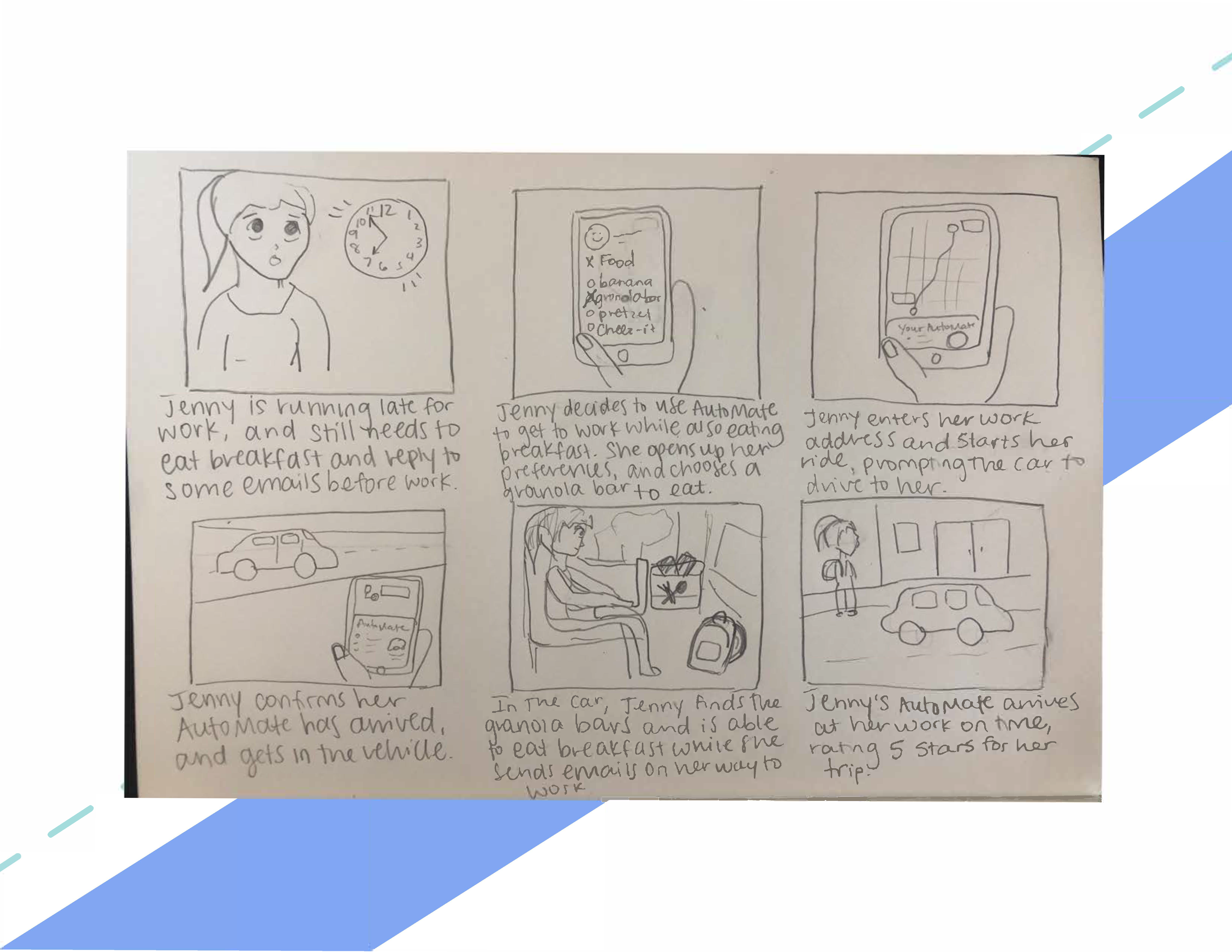
Create a rideshare brand that includes a style guide, logo, mockups of the website and mobile app, advertisements, and more.
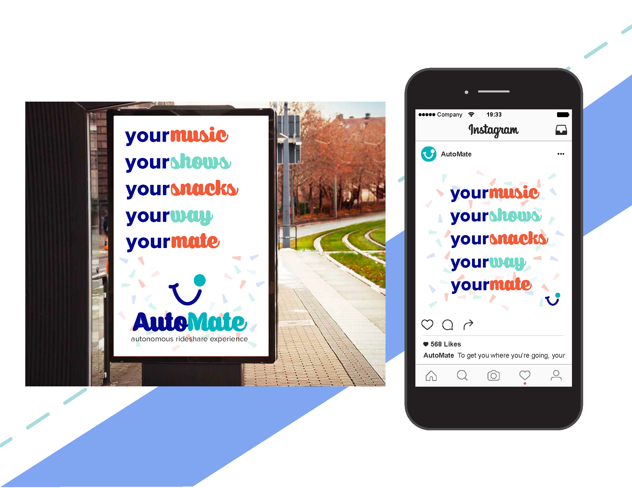
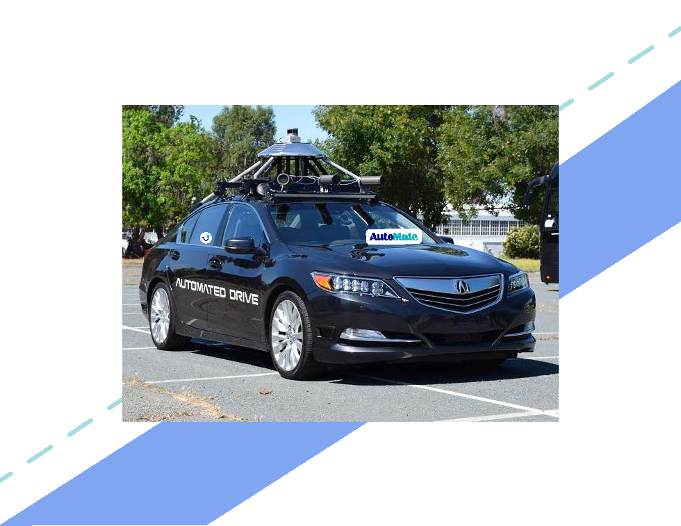
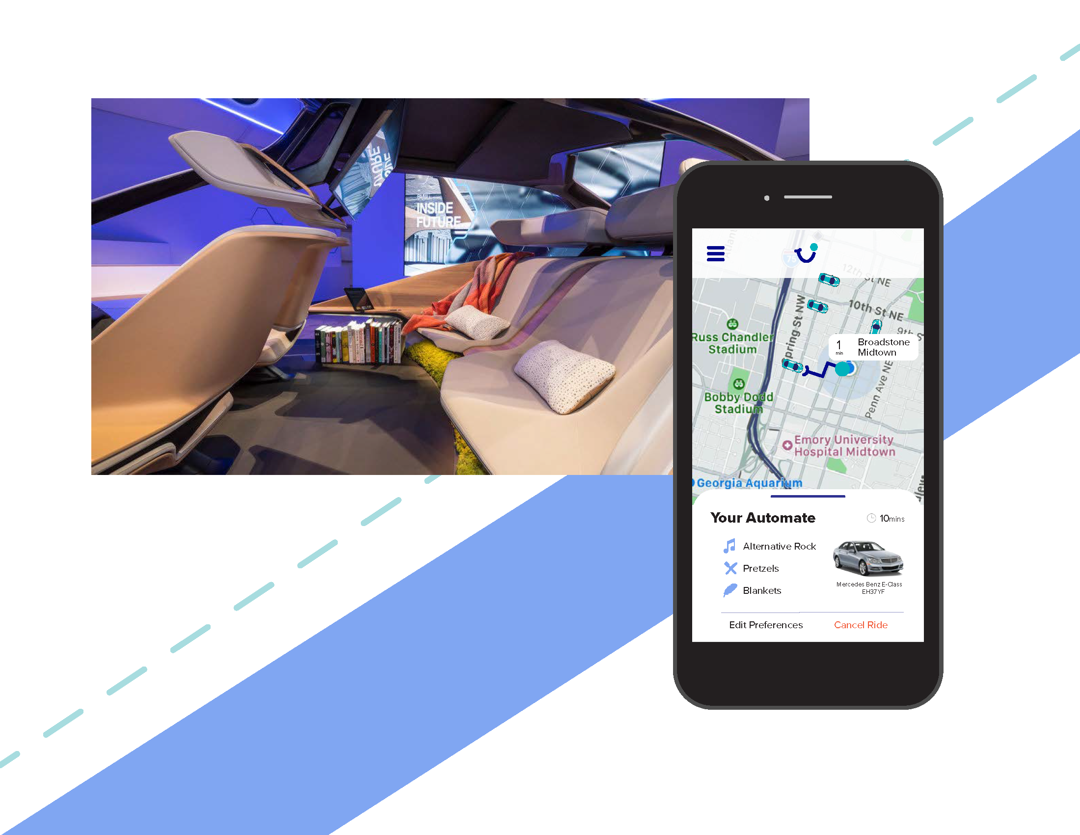
My brand, AutoMate, was created to instill fun, personalized experiences in an emerging and seemingly risky technology. AutoMate would set itsself apart from other autonomous rideshares by having personalization options - that is, allowing users to customize what they hear, see, eat, and how they relax. While this is not a luxury brand, this is one of comfort, and does not include more economical options, like carpooling. AutoMate is designed for users who are on the go, and a little more tech-centric than others.
• Graphic Designer
• UX Designer
• Researcher
• Just me
• Competitive Analysis
• Design Iterations
• Sketching
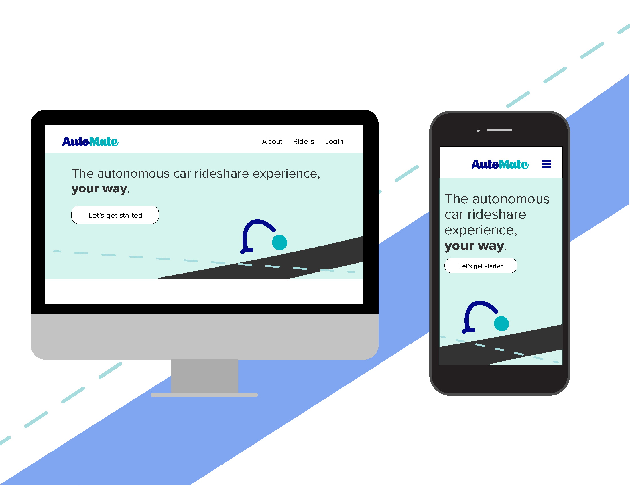
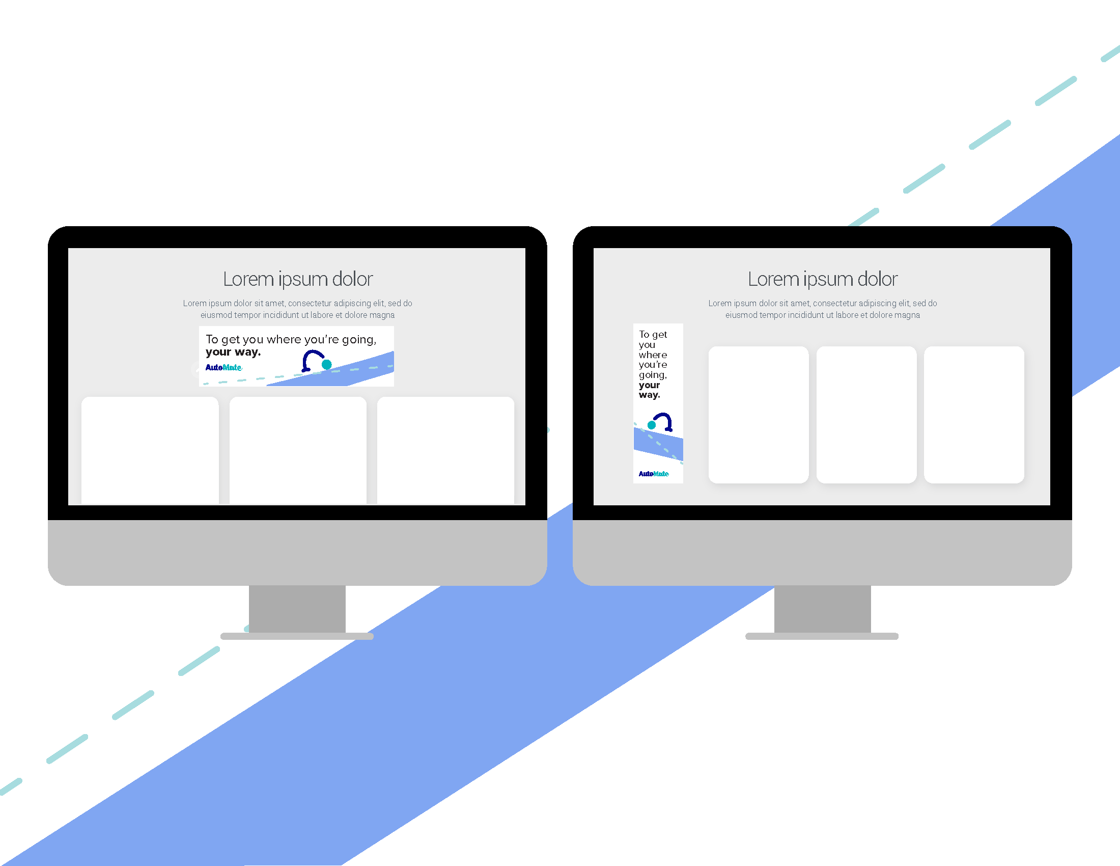
• High Fidelity Mockups
My brand, AutoMate, was created to instill fun, personalized experiences in an emerging and seemingly risky technology. AutoMate would set itsself apart from other autonomous rideshares by having personalization options - that is, allowing users to customize what they hear, see, eat, and how they relax. While this is not a luxury brand, this is one of comfort, and does not include more economical options, like carpooling. AutoMate is designed for users who are on the go, and a little more tech-centric than others. There is a threshold of trust that one must have before considering autonomous cars at this time, so those people who are pro-technology would be the people I would target. With this knowledge, my users would primarily be people in younger generations, however, I would not exclude middle-aged individuals who are excited about this emerging technology. Because of this, my brand can have these liberties of being fun, while continuing to instill that trust and safety in a new technology.
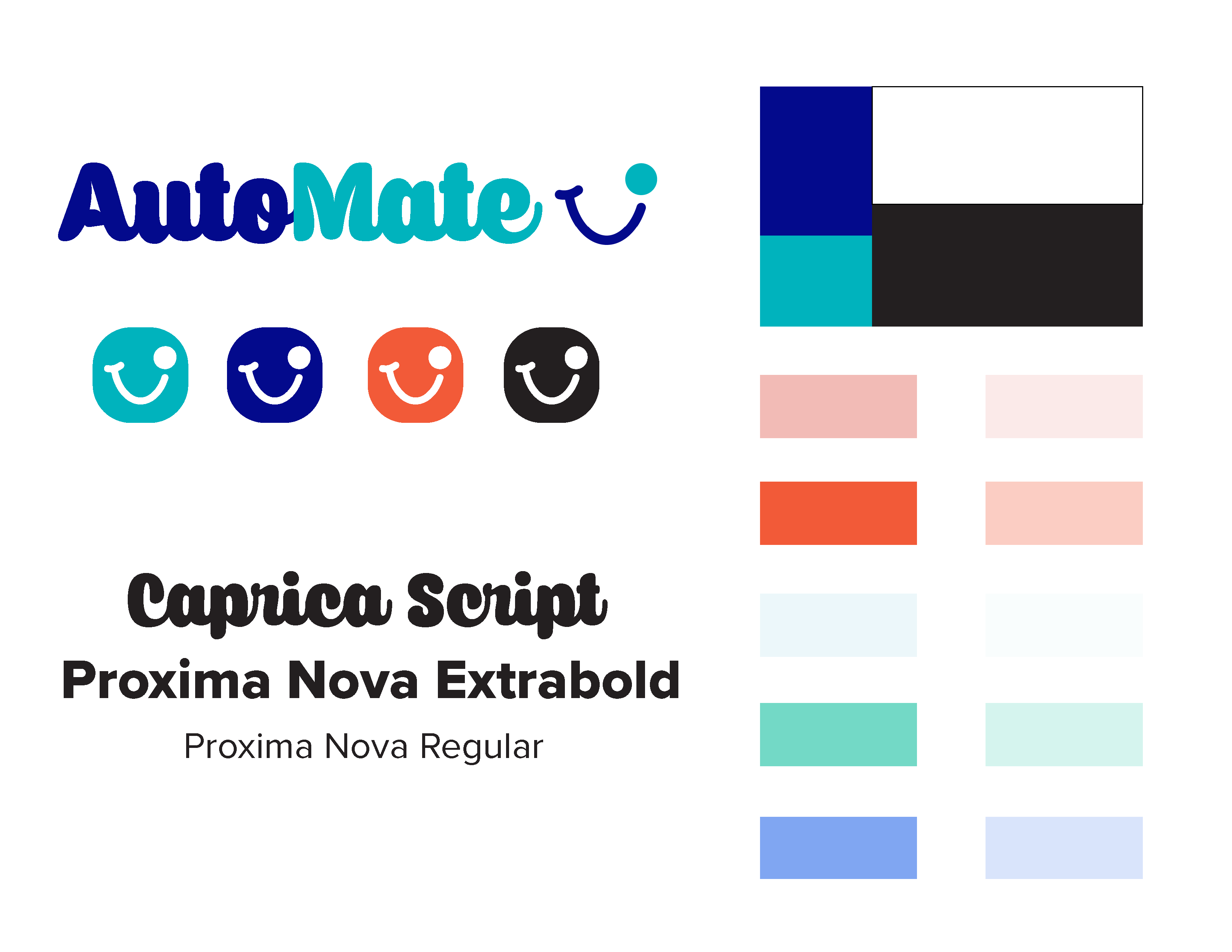
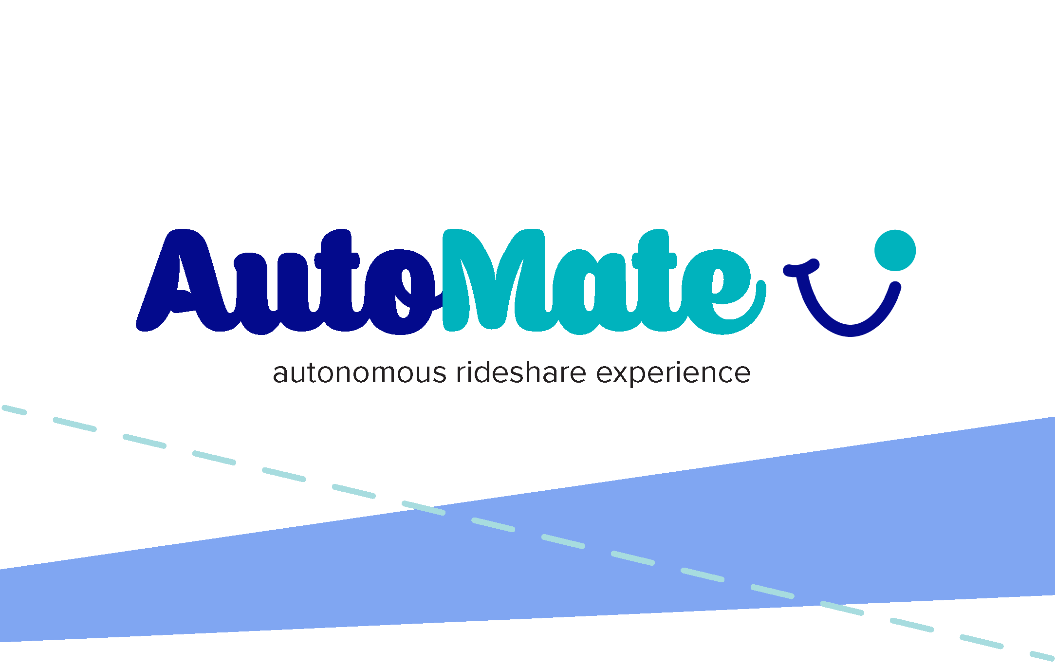
When it came to the brand, I wanted to make something that would instill this “fun” energy, while also ensuring trust within the brand. Because of this, I used a scripted font for the logotype, using it’s bold and curvy lines to instill a friendly but secure experience. The color schemes I chose were intended to make the experience seem light-hearted yet trustworthy, relying on more tech- forward colors of white, black, and blue, and falling back on secondary colors for the more friendly aspects.